NRMA Insurance
Droga5, 2024
Since its foundation in 1925, NRMA Insurance has been synonymous with a single word: Help. As the organisation approached its centenary, that word became the foundation of something more considered, a repositioning that moved NRMA Insurance from an insurance provider that offers help, to something more fundamental. A Help Company.
The brand optimisation that followed was guided entirely by that idea. Every decision, from typography to iconography, was made in service of making help feel clearer, more accessible, and more human.
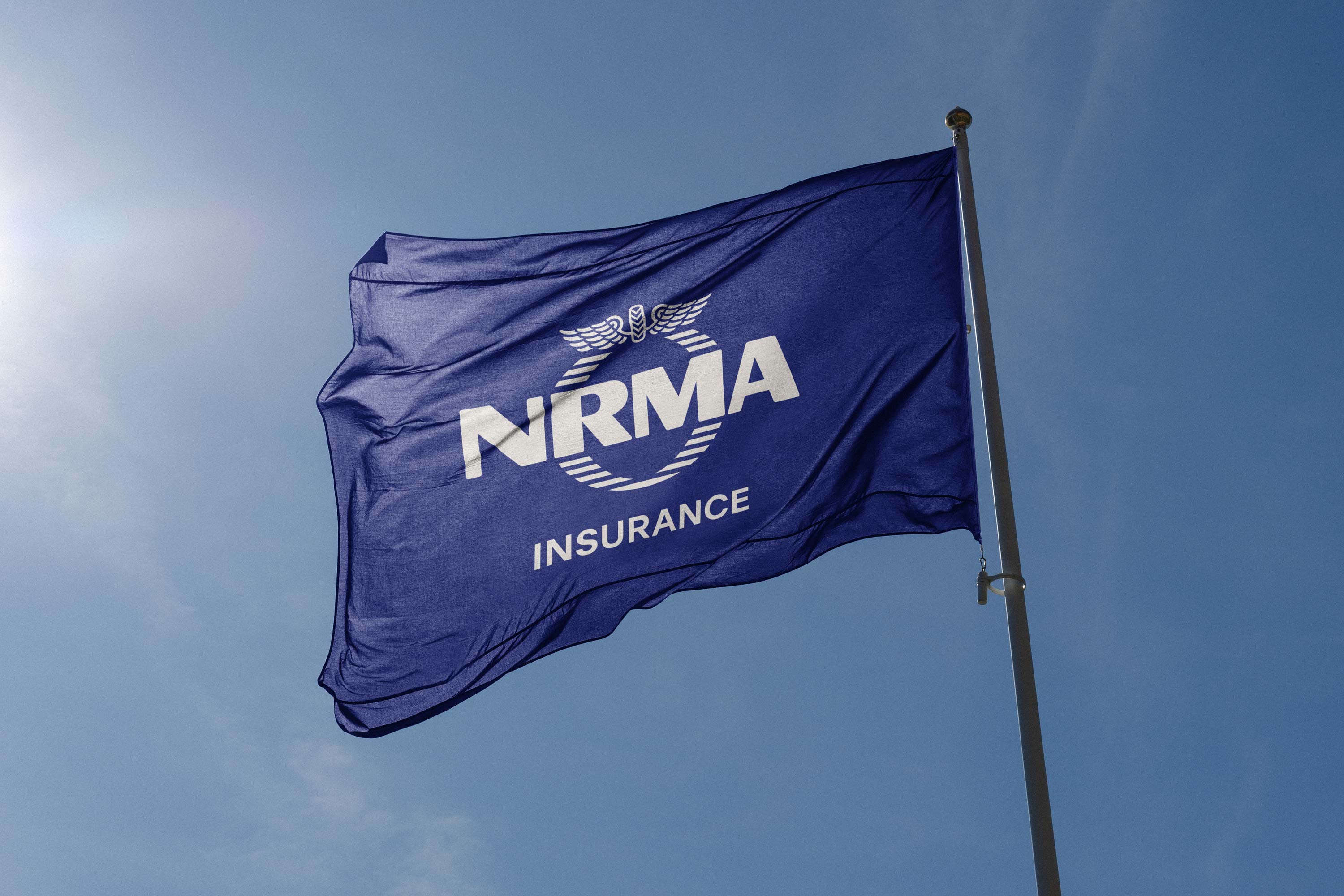

The historic logo was refined rather than replaced; optimised for clarity and recognition across the full range of modern formats without disturbing the equity of a mark carried for a century.
Next, a library of bespoke icons replaced a reliance on generic stock photography, giving customers a more considered and navigable way through the complexity of the insurance landscape. Alongside this, a refreshed colour palette brought greater coherence to the brand's visual presence across channels.


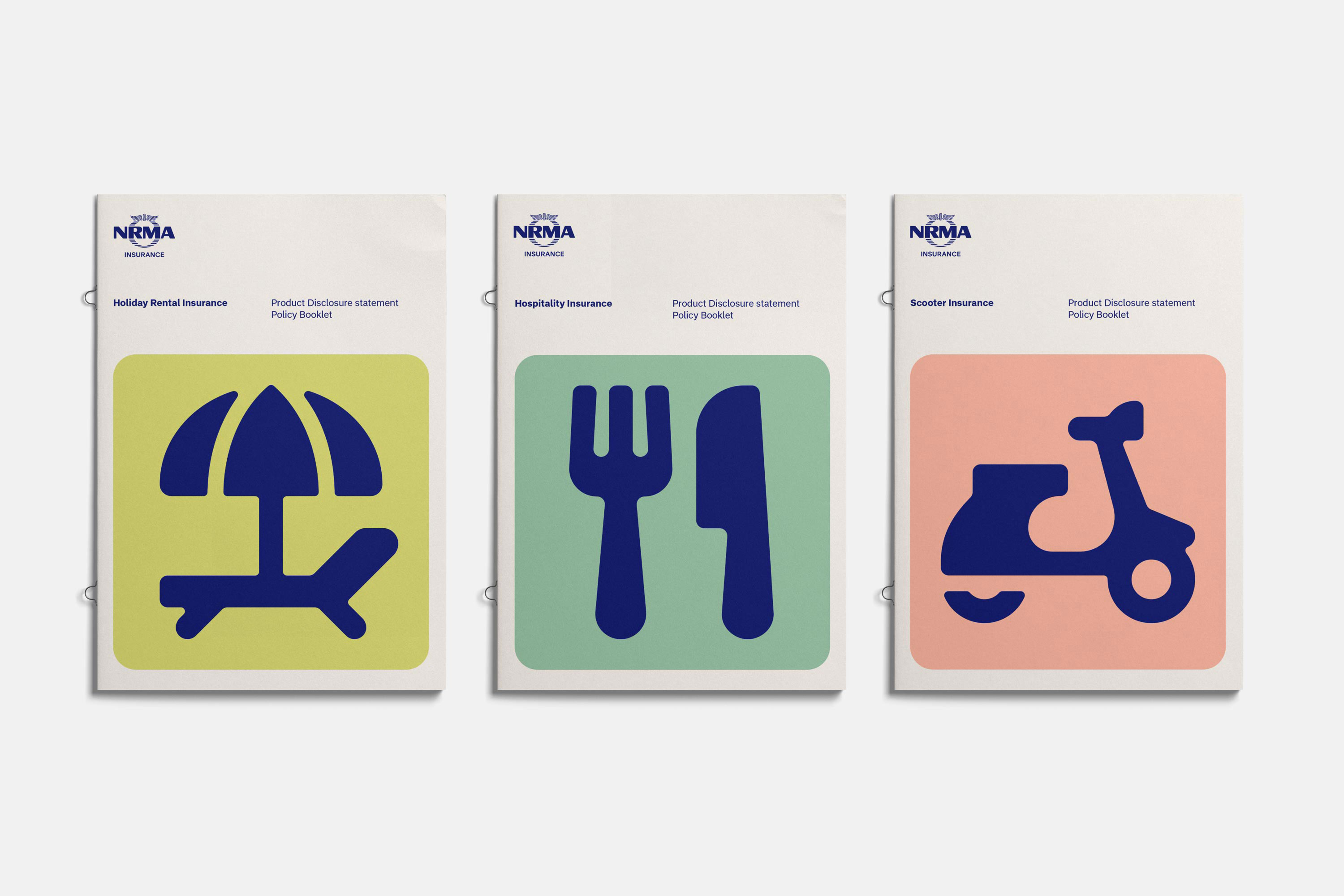
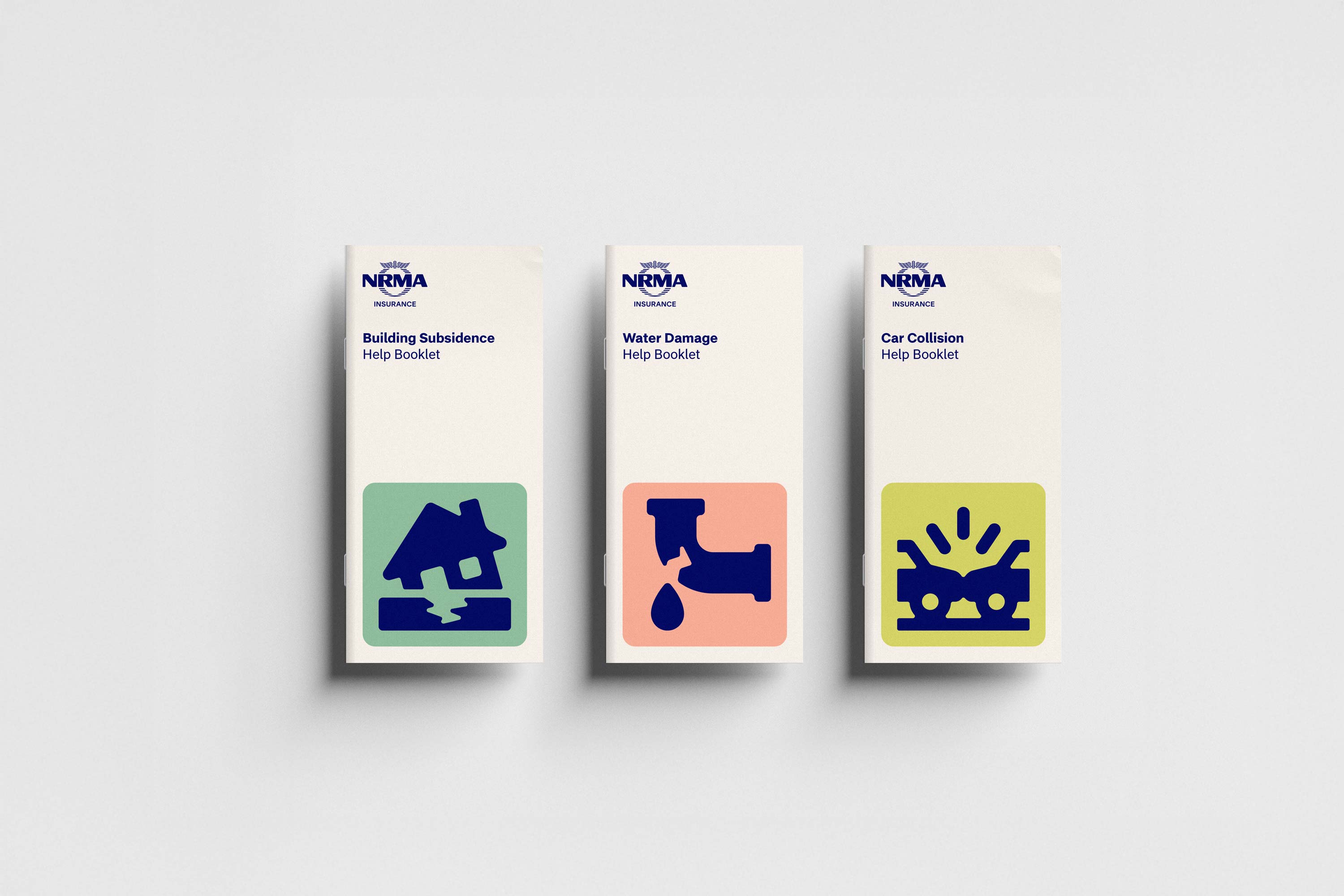

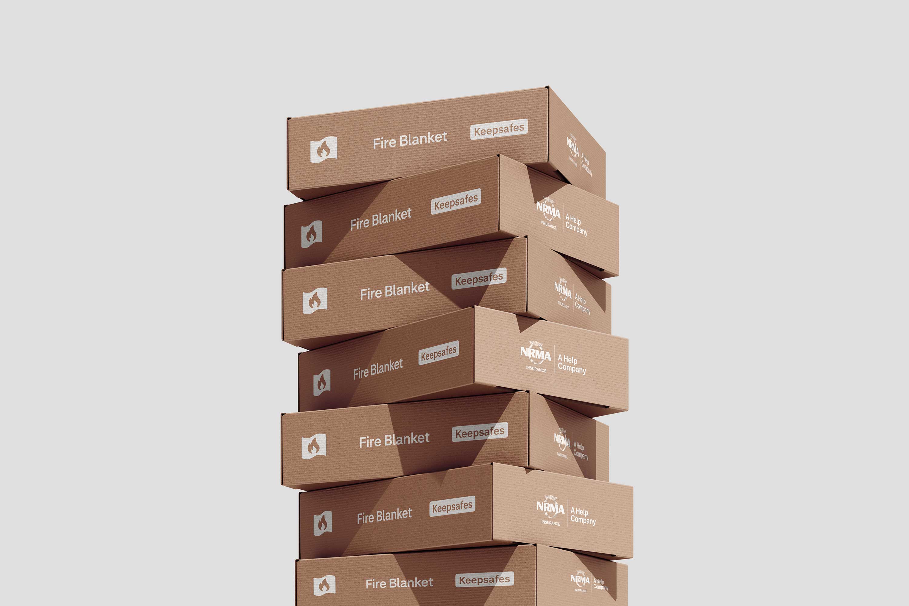


At the heart of the typographic system is a bespoke typeface developed in collaboration with type foundry Matter of Sorts. Comprising Display and Text variants, it was designed with legibility as its primary principle, ensuring accessibility and consistency across every application, at every size, for every reader.


To create cut-through in marketing, a suite of three-dimensional renders was developed, each one rooted in the foundations of the iconographical style established earlier to ensure continuity across the system. Rather than introducing decorative embellishment, the renders gave familiar forms a new dimension, bringing depth, physicality and visual appeal to communications without ever feeling disconnected from the broader identity.


Finally, a suite of shapes was introduced, each form derived from the heuristics of Help itself. Applied across NRMA Insurance's full ecosystem, these shapes provide a flexible but disciplined framework for containing complex information, making the difficult feel navigable, and the unfamiliar feel familiar.

Completed while Executive Creative Director at MAUD, alongside Jess Tainsh, Lily Hodgson, Gary Corr and Tomas Sabbatucci. Iconography by Forma (Espana), Renders by Craft Shop (New Zealand). Logo optimisation by Matter of Sorts (Australia).