Suncorp
MAUD, 2017
Insurance is a category that has historically spoken the language of fear. The fine print, the what-ifs, the careful management of worst-case scenarios. Suncorp had the opportunity to say something entirely different, and the brief was to find out what that looked like.
At the heart of Suncorp's name has always been the sun. Not a decorative flourish but a genuine organising principle of warmth, clarity and optimism; the sense that tomorrow can be better than today.
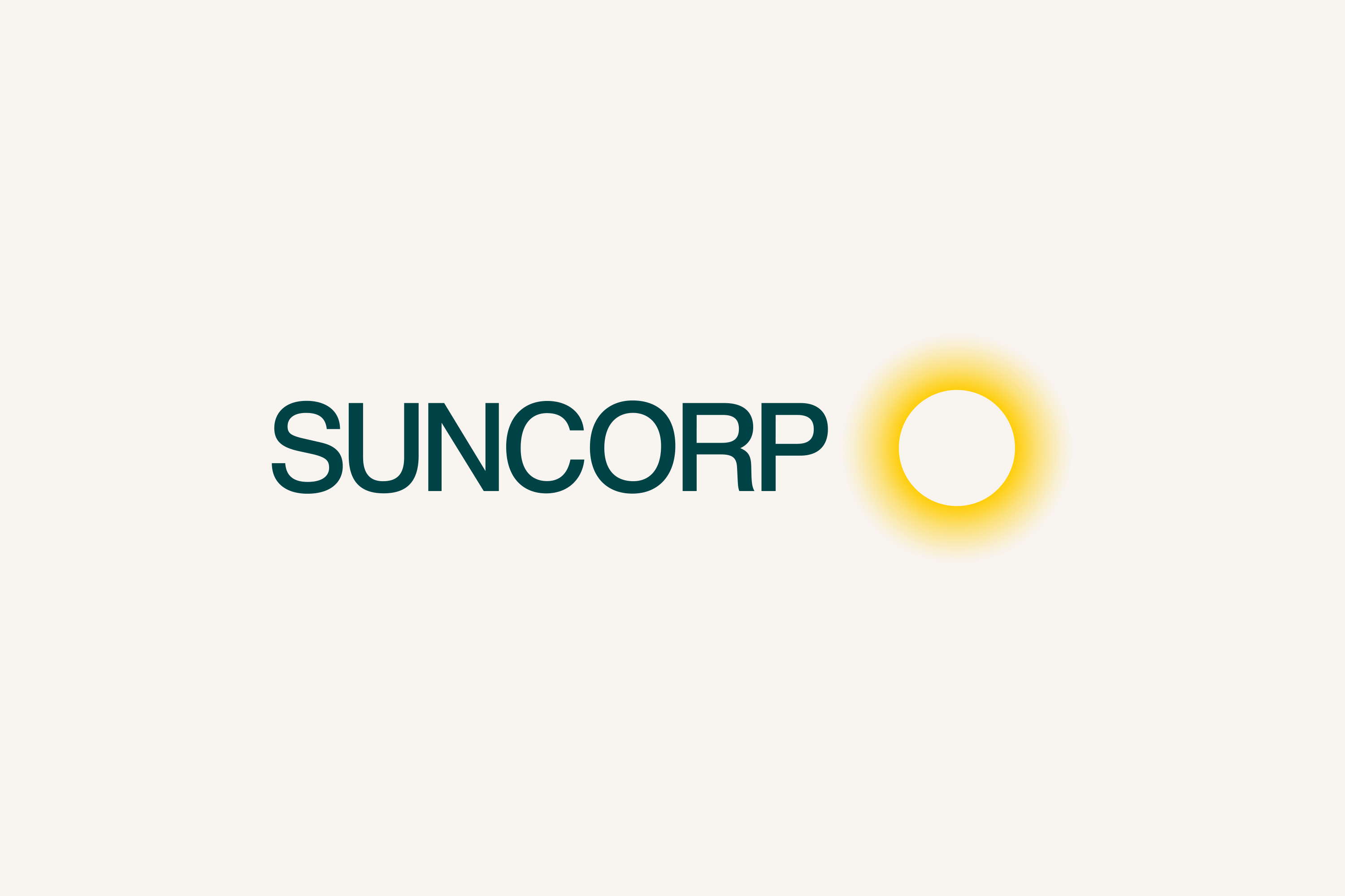
The new logo places the sun at its centre, rendered with the kind of considered simplicity that allows a mark to carry meaning without explaining it. Alongside it, a rational wordmark provides the stability and legibility that a financial services brand demands. Together they introduce something the category rarely offers its customers: light.
That spirit of optimism and openness extended across the full identity system. A commitment to honesty and optionality, the sense that Suncorp is genuinely on the customer's side, offering real choices rather than managing them through complexity became the creative framework for every subsequent decision.
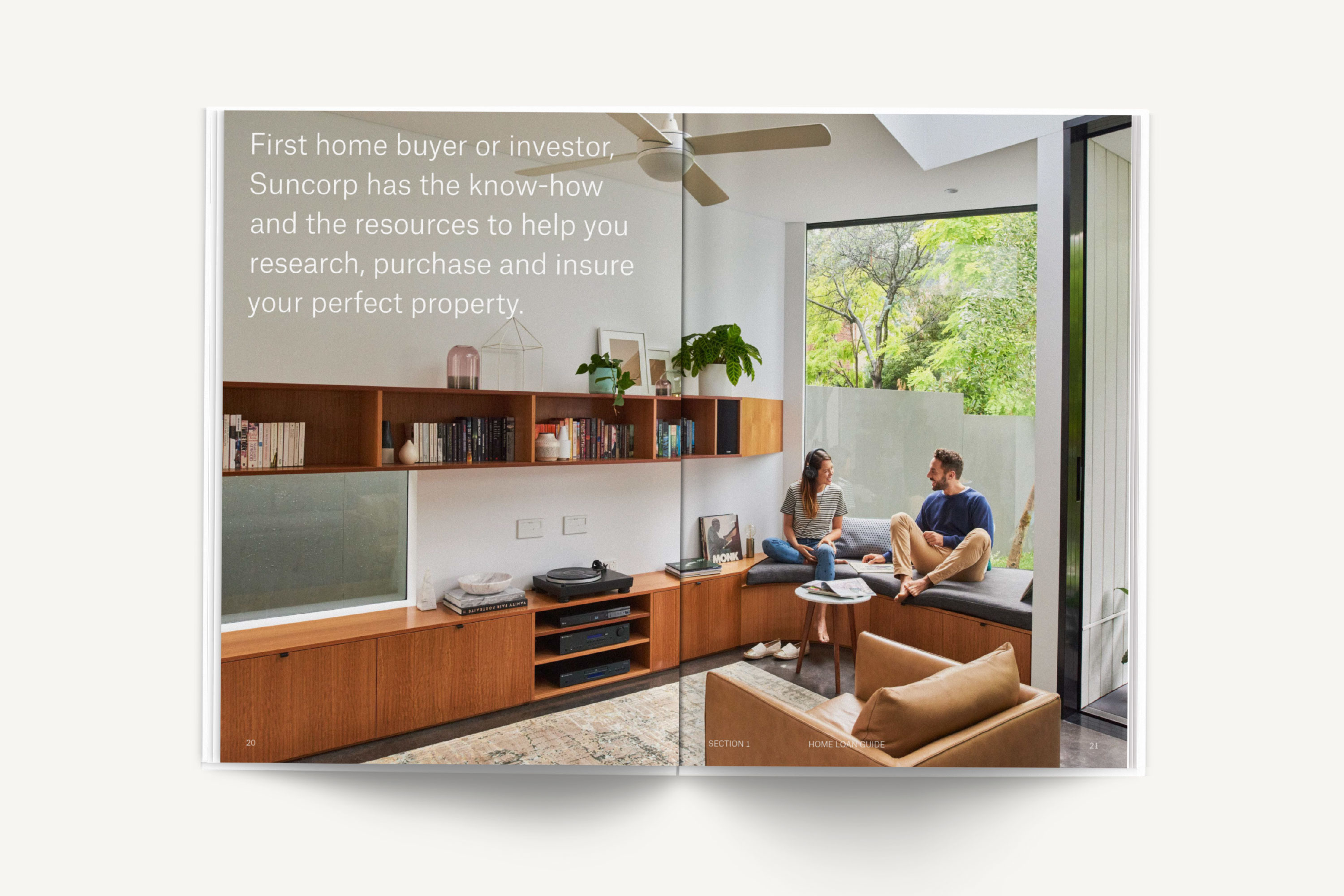
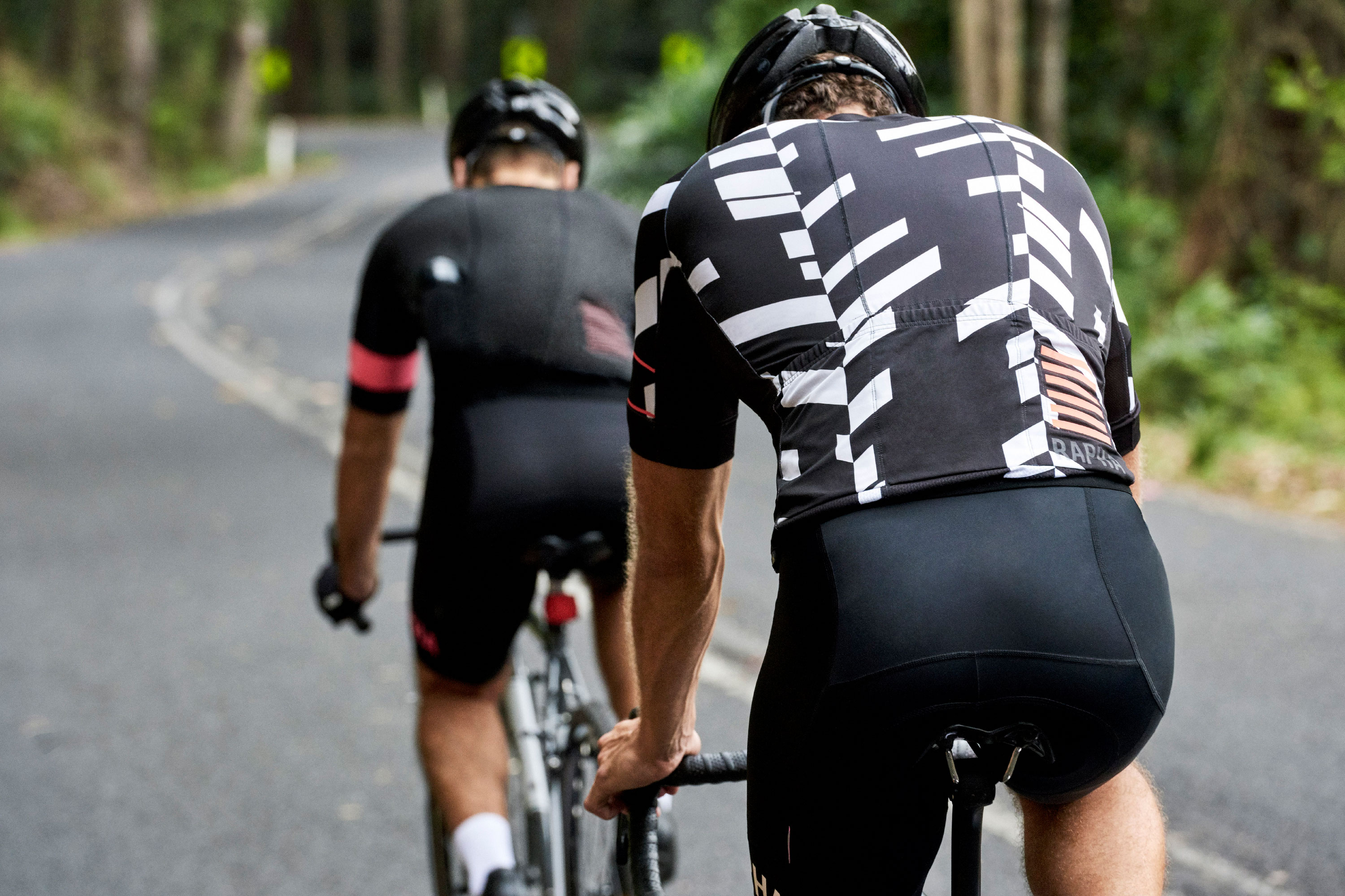
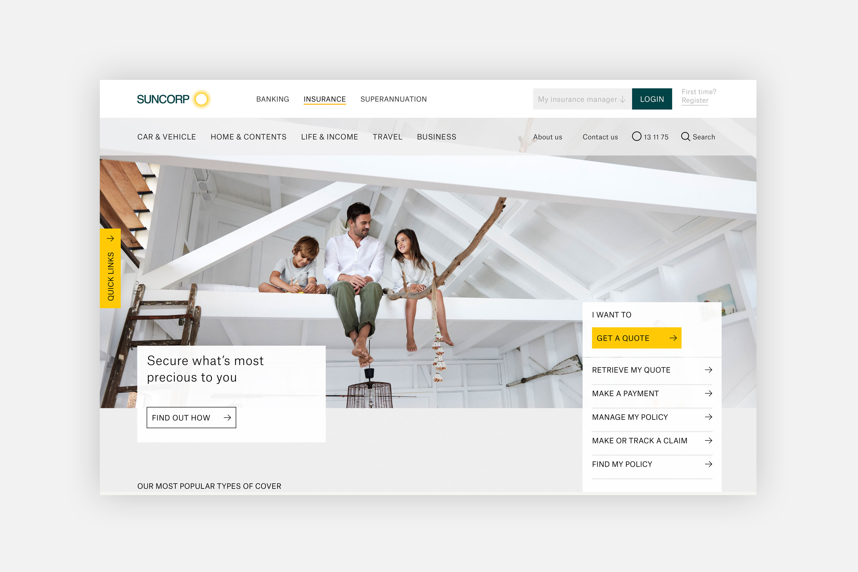
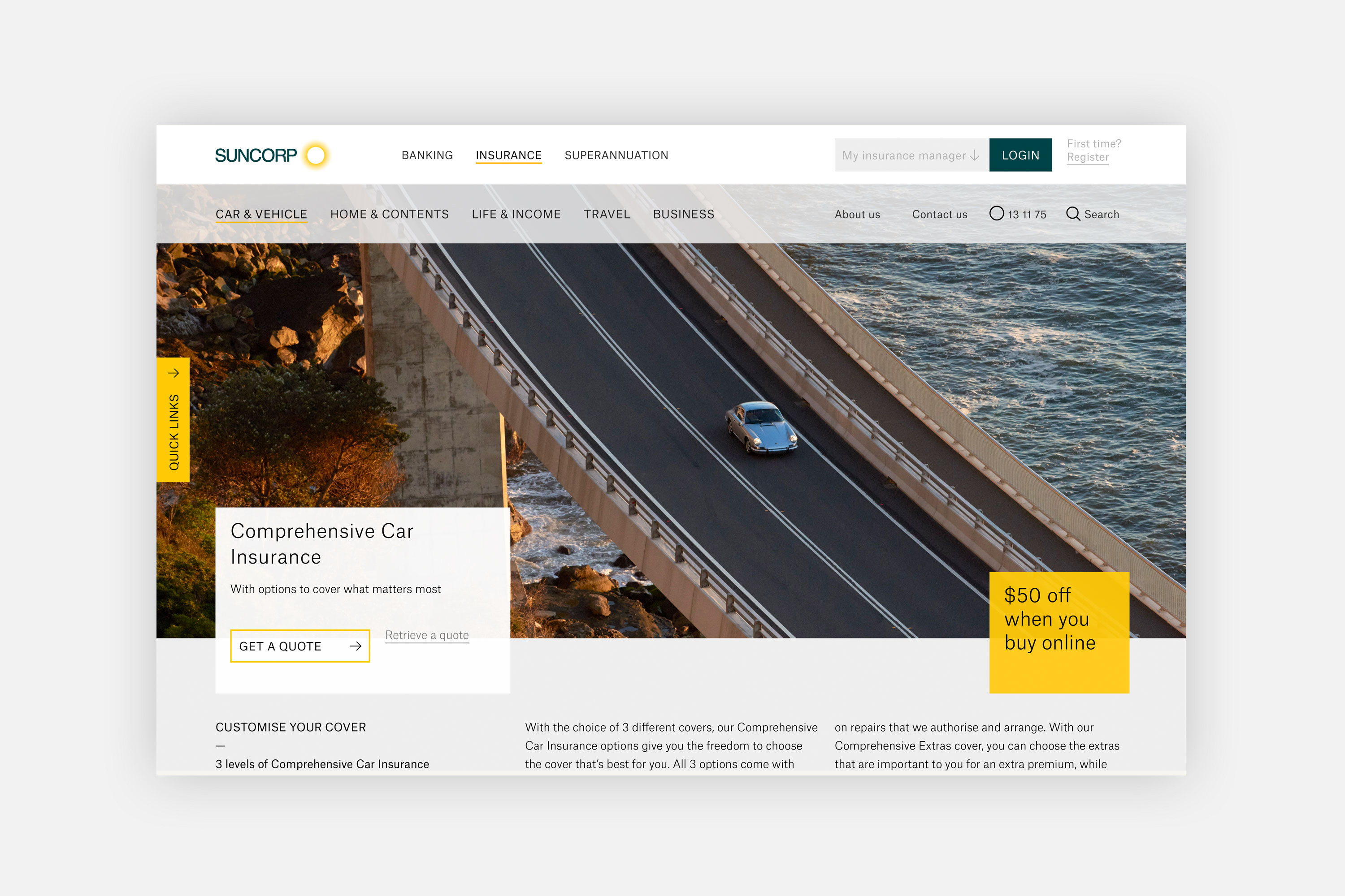
To bring that feeling to life we collaborated with Derek Henderson, one of the most distinctive photographers working in Australia today. His images carry an authenticity and warmth that stock photography cannot approximate; real people, real light, real moments that feel neither staged nor sanitised.
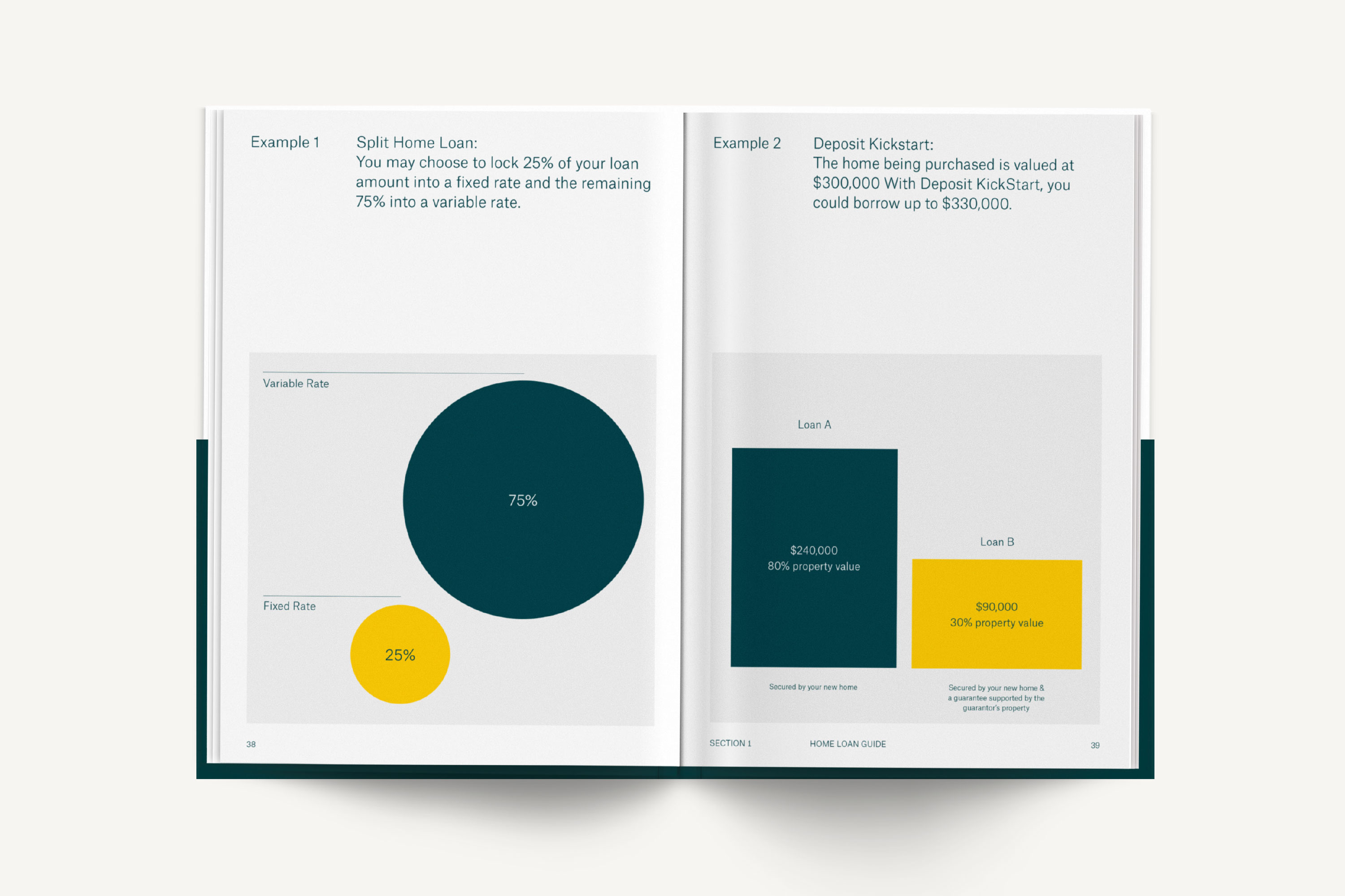
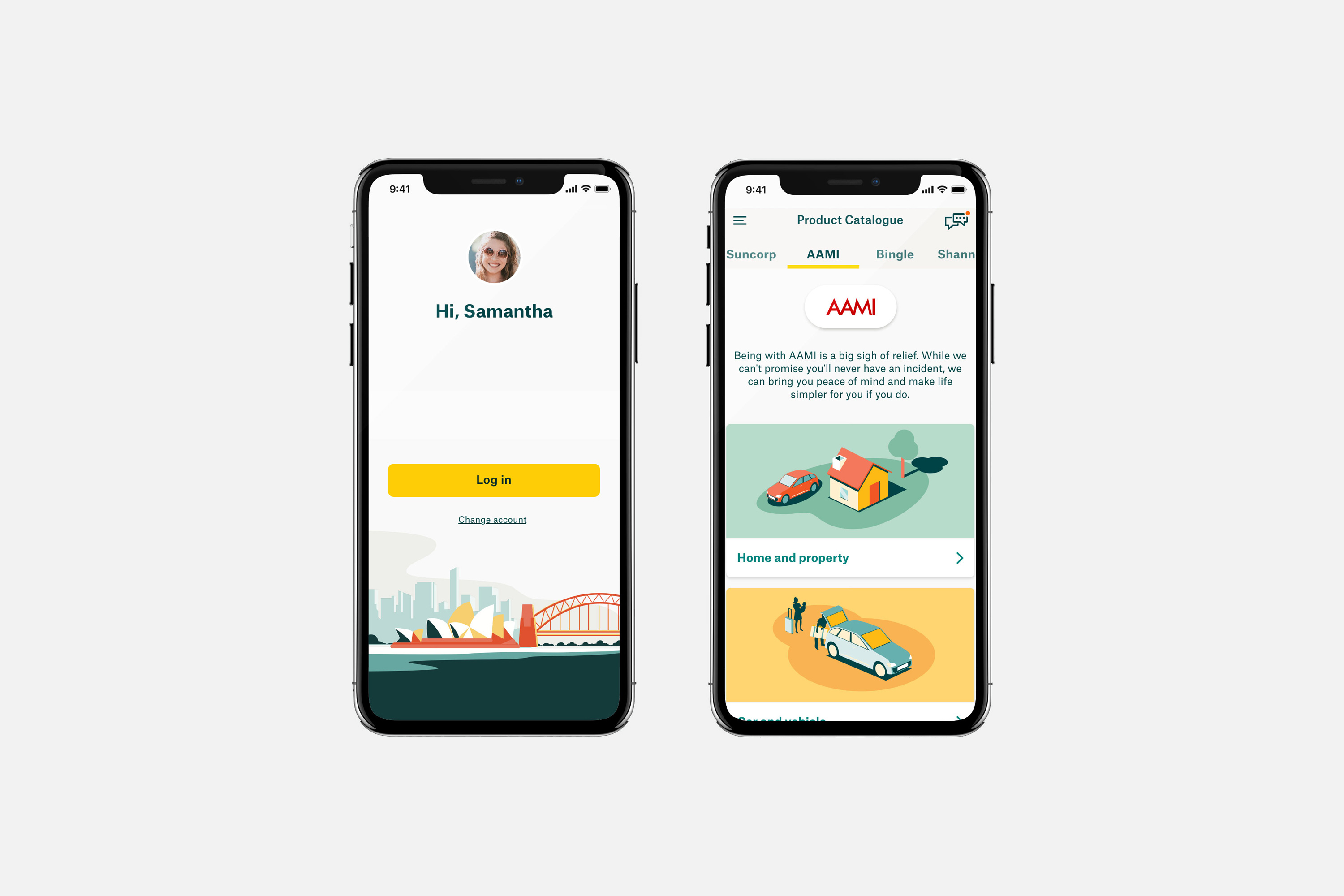
A comprehensive library of illustrations and iconography completed the system, giving Suncorp the visual tools to navigate the inherent complexity of insurance with clarity and humanity — making the difficult feel approachable, and the abstract feel real.














Completed while Design Director at MAUD, alongside Daniel Flynn, Tomas Sabbatucci and Adam Vella. Strategy by Lisa Aitken and Paul O’Connor. Photography by Derek Henderson.